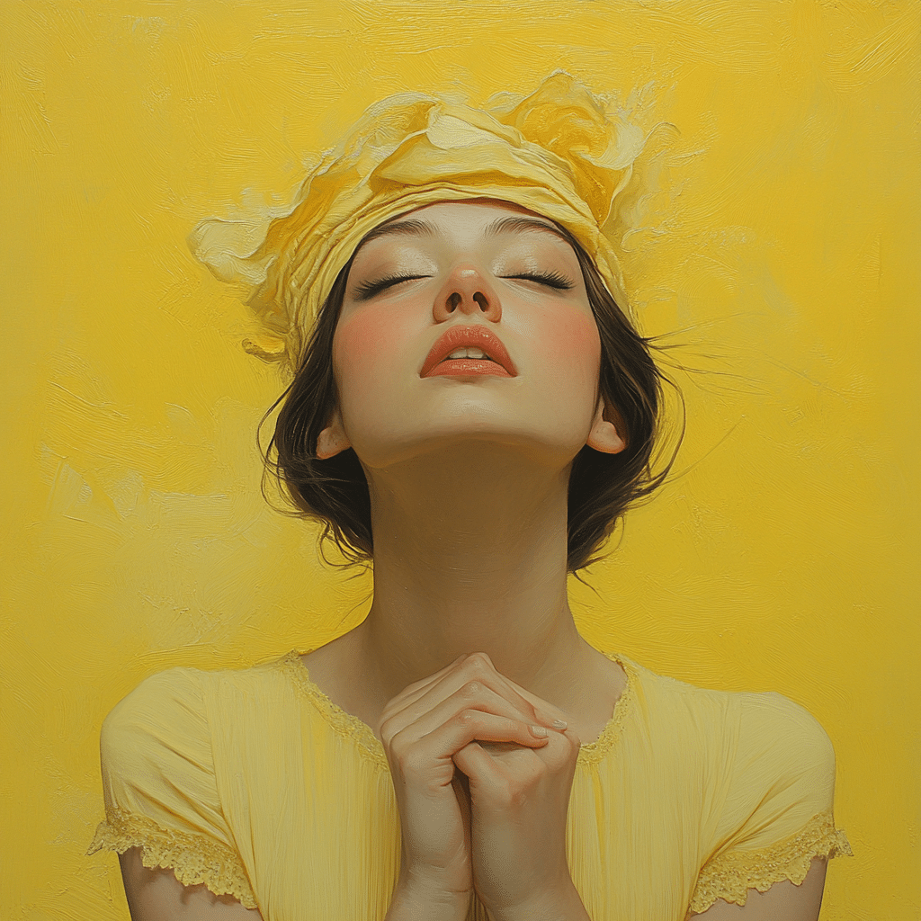
The color pastel yellow has bloomed into the spotlight in 2024, embodying a delightful blend of warmth, joy, and elegance. This creamy shade echoes the soft glow of early morning sunlight and reflects the delicate petals of spring flowers, reminiscent of cheerful buttercups. Whether you’re a fashion enthusiast, entrepreneur, or designer, integrating pastel yellow into your palette can uplift your aesthetic and inspire positive vibes in both personal and professional spaces. Let’s dive deeper into how you can embrace this vibrant hue and why it’s worth its trendsetting place in our lives.
1. Embracing the Trend of Pastel Yellow in 2024
As we step into 2024, pastel yellow stands out prominently across design and fashion landscapes. This tender shade radiates optimism and positivity, making it an appealing choice for brands aiming to connect with their audiences emotionally. Compared to sharper colors, pastel yellow offers a serene elegance that enhances everything from casual wear to high-end fashion.
For the ambitious entrepreneur, understanding trends like pastel yellow is key. It’s not just a color; it represents a mindset. By tapping into this shade, brands can create an approachable image. This wisdom is reflected in branding strategies, where leading companies are shifting towards softer color palettes to elicit feelings of comfort. So here’s the chance to step outside your comfort zone and paint your professional world with this sunny hue!
2. Top 7 Ways to Incorporate Pastel Yellow into Your Wardrobe
Now that we’re inspired, how do we bring pastel yellow into our daily lives? Here are seven fantastic ways to seamlessly weave this cheerful color into your wardrobe:
1. Statement Accessories
Why not make a splash with pastel yellow accessories? Think about bags and shoes as your outfit’s bright spot. Brands like ASOS and Accessorize have an eye-catching selection. Imagine strutting down the street with a pastel yellow handbag from Kate Spade, effortlessly paired with a laid-back pastel blue dress. Instant chic alert!
2. Layering with Pastel Purple
Layering isn’t just practical; it’s trendy! Combining pastel yellow with pastel purple can lead to a stunning result. Picture a pastel yellow blazer over a soft lavender blouse from H&M, teamed with crisp white trousers. The outcome? A sophisticated style that commands attention.
3. Casual Chic Ensembles
Headed for a relaxed day out? Slip on a pastel yellow tee or sweatshirt from Everlane, and match it with pastel pink joggers. This combination screams casual chic while keeping that elegant touch. You’ll feel comfy yet fashionable—perfect for brunch or errands.
4. Seasonal Dresses
Spring is the ideal season for donning pastel yellow dresses. Designers like Roksanda and Eloquii have gorgeous styles out there. A flowy floral pastel yellow maxi dress is an excellent choice for weddings or garden parties. Not only will you exude positivity, but you’ll literally brighten the atmosphere!
5. Creative Prints
Mix things up! Pairing pastel yellow with playful prints can create a dynamic outfit. Zara’s collections often showcase floral patterns that marry pastel yellow and other soft hues beautifully, resulting in excitement and flair in your look.
6. Home Decor Enhancements
The versatility of pastel yellow extends beyond fashion. Want to revamp your living space? Consider adding pastel yellow cushions or curtains to your home. Anthropologie offers elegant home accessories that blend superbly with shades like pastel purple and pastel blue.
7. Artisanal Influence
Support artisan brands, like Free People, which celebrate color through beautiful craftsmanship. Their pastel yellow bohemian pieces adorned with intricate embroidery stand out. Combine these unique find with other pastels for a striking look!
3. Pastel Palettes: The Harmony of Colors
Exploring the interaction of pastel yellow with other pastels opens up exciting possibilities. This soft shade pairs beautifully with pastel purple and pastel blue, creating palettes that are both soothing and lively. For graphic designers, tools like Adobe Color Wheel can help visualize these combinations, unleashing creativity while ensuring harmonious designs.
When color palettes harmonize, they evoke emotions, making them powerful tools in branding and product design. Companies can leverage these pastel combinations to create visuals that resonate with their audience, instilling calmness and joy. So remember, a splash of pastel yellow can bring warmth to any collection!
4. Psychological Impact of Pastel Yellow
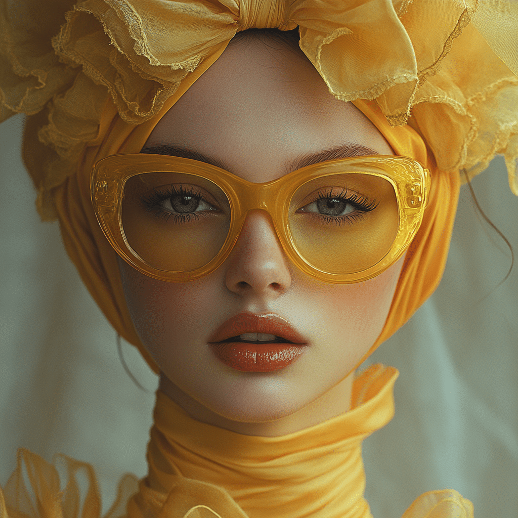
Colors significantly influence our emotions, and pastel yellow is no exception. This color stimulates feelings of happiness and positivity and is often associated with joy. Research showcases how brands like McDonald’s use cheerful colors to evoke comfort, reminding us of the psychological power of hues in branding and packaging.
In the clothing industry, using pastel yellow can shape consumer perception, making a brand feel approachable and fun. When people shop, they’re not just buying products; they’re seeking experiences and feelings. By incorporating this joyful tone, businesses can create a more engaging and memorable shopping journey.
5. The Future of Pastel Trends
Looking ahead, the popularity of pastel shades isn’t fading anytime soon. They’re becoming a staple in sustainable and ethically produced apparel. As consumers demand more eco-friendly options, brands may experiment with innovative ways to incorporate pastel yellow into collections that emphasize joy and optimism.
It’s exciting to see how contemporary fashion designer might stretch the boundaries of what pastels can signify emotionally. Expect to see collections intertwine emotional depth with stunning aesthetics. Pastel yellow symbolizes positive living and invites everyone to embrace a brighter state of mind.
With all this in mind, the allure of pastel yellow in 2024 continues to grow, igniting a passion for joyous elegance. So let’s embrace this captivating hue and let it inspire our worlds, both personally and professionally. Whether sprucing up your wardrobe or transforming daily experiences, pastel yellow invites us all to shine a little brighter!
Pastel Yellow: A Color That Brings Joy
The Bright Side of Pastel Yellow
Pastel yellow isn’t just another color in the crayon box; it’s a symbol of happiness and tranquility that can transform your mood with just a glance. This delightful hue has been known to spark creativity and uplift spirits, making it a favorite among designers and artists alike. Did you know that this vibrant shade has even found its way into haute couture? Fashion icons have embraced colors like pastel yellow, creating collections inspired by nature, such as Jean Paul Gaultier’s stunning Paradise Garden line that radiates sunlight and positivity.
Turning to the world of music, pastel yellow often reflects the dreamy essence captured in albums like Pink Floyd’s Dark Side of the Moon. Just as the album paints a sonic landscape filled with wonder, the color pastel yellow brings a similar warmth of joy to our visual experiences. Whether it’s in fashion, music, or the beauty of nature, pastel yellow is everywhere, making it the perfect backdrop for lively days and serene nights.
A Taste of Pastel Yellow
In the kitchen, pastel yellow isn’t just pleasing to the eye; it can be a mouthwatering experience too! Consider dishes that use vibrant, yellow ingredients—like saffron and even Serrano Peppers—which brighten up any meal with their striking appearance and delightful flavors. They might inspire a touch of pastel yellow on your plate, tantalizing your taste buds while inviting you to explore exotic foods that merge taste and aesthetics.
Apart from appealing to the culinary senses, the sunny shade is also becoming a popular choice for home decor. Picture a cozy living room adorned in pastel yellow accents, evoking a soothing atmosphere reminiscent of a sunny afternoon at Big Sur, where the color of sand mingles effortlessly with sunlit skies. This joyful elegance of pastel yellow is all around us, whether in art, fashion, or culinary delights.
Pastel Yellow in Pop Culture
And, we can’t forget about the charm it brings to Hollywood! Iconic actress Lena Olin often graces the screen with an air of elegance that resonates with the cheerful essence of pastel yellow. Much like her captivating performances, the color enhances the allure of any scene it graces. When it comes to sports, even the rivalry in games, such as Lsu Vs South carolina, can be brightened up with pastel yellow as part of team colors, creating an electrifying atmosphere that unites fans in celebration.
As we go about our daily lives, it’s clear that pastel yellow captivates not just through its aesthetic pleasures but also its unyielding ability to spread joy. So, the next time you see a splash of pastel yellow, remember its rich tapestry of associations—from music to fashion and even cuisine. Embrace this color and let its cheerful elegance shine!
What is the color pastel yellow?
Pastel yellow is a delicate, creamy shade that blends the brightness of yellow with a soft, muted tone, kind of like the gentle light of dawn or the petals of a buttercup. The hex code for pastel yellow is #FDFD96, making it a distinct shade in the world of colors.
What colors are similar to pastel yellow?
Colors that are similar to pastel yellow include soft shades like butter yellow, lemon chiffon, and cream, though these shades have their own unique characteristics. “Lemon” often pops up as a name for a brighter yellow, but pastel yellow stands apart.
What color is very pale yellow?
Very pale yellow can be referred to as “cream” or sometimes “buttermilk,” depending on just how light it gets. However, cream has a hint of beige, while pastel yellow keeps more of that sunny vibe.
Is purple a pastel?
Purple can indeed come in a pastel shade. Pastel purple, often seen as a softer take on the regular purple, has more of a dreamy and gentle vibe, making it a lovely fit in pastel palettes.
What are the 4 main pastel colors?
The four main pastel colors commonly found in wall designs are pastel blue, pastel pink, pastel green, and pastel yellow, which together create a fresh, calming environment.
What is pale yellow called?
Pale yellow is typically called “cream” or “light yellow,” but it can also be referred to as “buttermilk” when it really gets light, with subtle differences in warmth and saturation.
What is the most attractive yellow color code?
The most attractive yellow color code often depends on personal taste, but many people are drawn to hex code #FFEA00, which represents a bright, cheerful hue that really stands out.
Is pastel yellow warm or cool?
Pastel yellow is considered a warm color because it has that sunny and cheerful vibe, making it feel inviting and cozy in a room.
What is the opposite color of pastel yellow?
The opposite color of pastel yellow on the color wheel is a shade of purple, as yellow and purple are complementary colors, creating a nice visual contrast when put together.
What is the difference between light yellow and pale yellow?
Light yellow and pale yellow are often used interchangeably, but light yellow may have a bit more brightness to it, while pale yellow is more muted and soft.
What color is canary yellow?
Canary yellow is a bright, vibrant shade that’s much bolder than pastel yellow, and it brings to mind the cheerful color of canary birds, which is why it’s so eye-catching.
Is cream pale yellow?
Cream can indeed be considered a very pale yellow, but it typically has a hint of beige or tan in it, giving it a warmer tone compared to pure pastel yellow.
What three pastel colors go together?
Three pastel colors that go together beautifully are pastel pink, pastel blue, and pastel yellow—these colors complement each other and create a light, airy feel.
Is lilac a pastel shade?
Yes, lilac is a pastel shade. It’s a soft, muted purple that fits in perfectly with other pastel colors, giving off a gentle, calming vibe.
Is Celadon a pastel color?
Celadon, which is a soft greenish hue, is also considered a pastel color. It’s easy on the eyes and works well in a range of color palettes.
What is the most similar color to yellow?
The color most similar to yellow is probably a light or soft yellow, often referred to as pastel yellow, but you can also think of colors like lime or lemon to produce that sunny feel in different forms.
What are pastel colors compared to regular colors?
Pastel colors are way softer and lighter compared to regular colors, giving them a more subtle, dreamy quality that can create a serene atmosphere in any space.
How do you match pastel colors?
To match pastel colors, it’s best to stick to lighter shades that complement each other, like pairing pastel blue with pastel pink and pastel yellow for a gentle harmony that doesn’t compete but rather enhances.
What are other pastel colors?
Other pastel colors you might love include pastel mint, pastel lavender, and pastel peach, each adding their own unique touch to pastel palettes.
Is pastel yellow warm or cool?
Pastel yellow is definitely considered a warm color, as it brings a sunny, cheerful feeling into spaces where it’s used.
Is pastel yellow a neutral color?
While pastel yellow can be seen as a softer, lighter color, it isn’t typically classified as a neutral color since it has distinct warmth and personality that stands out.
What is a pastel color?
A pastel color is characterized by its soft and light tone, often created by mixing a base color with white, resulting in hues that feel airy and gentle rather than bold and vibrant.
What is the color code for light yellow?
The color code for light yellow is often represented as #FFFFE0, which captures that soft, pale optimism without getting too bright like a standard yellow.
